I updated my Cyberpanel and really enjoyed the option of being able to customize the Design through CSS, my contribution follows. They could in the future provide options such as changing the logo and changing the login screen without the updates block, without having to go through the code.
I’m going to share a contribution that customized my dashboard with dark mode style. also called black mode, dark mode, dark theme or night mode - is a color scheme that uses light-colored text, icons, and graphical user interface elements on a dark background and is often discussed in terms of computer user interface design and web design. Many modern websites and operating systems offer the user an optional light-on-dark display mode.
Some users find dark mode displays more visually appealing, and they can reduce power consumption.
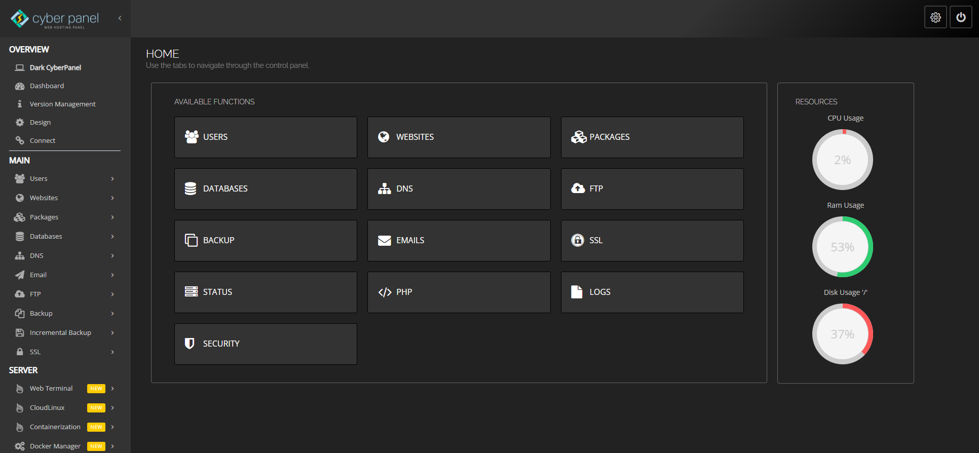
Just copy and paste style code into the Design text area of your dashboard.
body {
    font-size: 14px;
    color: #ccc;
}
.bg-gradient-9 {
    background: #000;
    background: -moz-linear-gradient(-45deg, #000 0%, #333 30%);
    background: -webkit-linear-gradient(
-45deg, #000 0%, #333 30%);
    background: linear-gradient(
-45deg, #000 0%, #333 30%);
    filter: progid:DXImageTransform.Microsoft.gradient(startColorstr='#333', endColorstr='#000', GradientType=1);
}
#sidebar-menu {
    background: #333;
}
#page-sidebar ul li.header {
    color: #fff;
    font-size: medium;
}
#page-sidebar ul li a .glyph-icon {
    color: #fff;
}
#sidebar-menu > li > a {
	color: #ccc;
}
.btn-primary {
    background: #333;
    border-color: #000;
}
.btn-primary:hover, .btn-primary:focus {
    background: #202020;
    border-color: #FFF;
}
.panel{
	background-color: #222;
	border-color: #666;
}
#page-content {
    background: #222;
}
#page-title h2 {
    font-size: 22px;
    color: #fff;
}
.table {
    background: #333;
}
.bootstrap-timepicker-widget table td input, .chosen-container-multi, .chosen-container-single .chosen-search input, .dataTables_length select, .form-control, .input, .ui-toolbar input, .ui-toolbar select, div.dataTables_filter input{
	background: #333;
    color: #ccc;
    border: 1px solid #9b9b9b;
    -webkit-box-shadow: inset 1px 1px 3px #222;
    -moz-box-shadow: inset 1px 1px 3px #222;
    box-shadow: inset 1px 1px 3px #222;
}
.bootstrap-timepicker-widget table td input:focus, .chosen-container-active, .chosen-container-multi.chosen-container-active, .form-control:focus, .input:focus, .selector.focus, .ui-toolbar input:focus, .ui-toolbar select:focus, div.dataTables_filter input:focus {
    color: #fff;
    border-color: #fff;
}
1-Copy the code.
2-Go to CyberPanel > Design
3-Paste the code to the text area.
4-Save and come to the dark side.

